Transform the Timeline v2
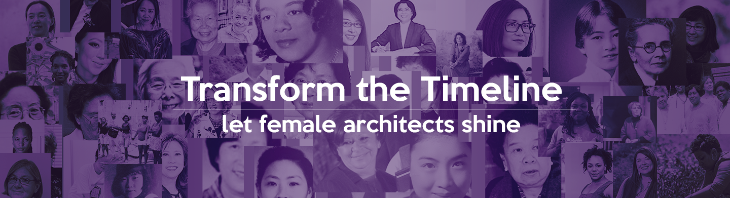
Calling for Non-white-male Architects!
Transforming the Timeline is a group project for SES 5419: Hidden Figures: The City, Architecture and the Construction of Race and Gender. We are encouraged by Professor Hansy Better Barraza to create a radical archive of architects/landscape architects/planners who are underrepresented in modern society due to their gender, nationality, and sexuality. We decided to break the traditional categories and weave an interconnecting net. We chose themes over professions, hoping to give them the credits they deserve.
I am in charge of the theme “Asian by Geography and Identity” and “Artivism” research. I also led the website design and development during the course.
This previous project is achieved by the group. The later UX research and design are finished by me.Tools used: Illustrator, Photoshop, XD, Cargo, Balsamiq Wireframes, pen and paper
My role: UX researcher and designer
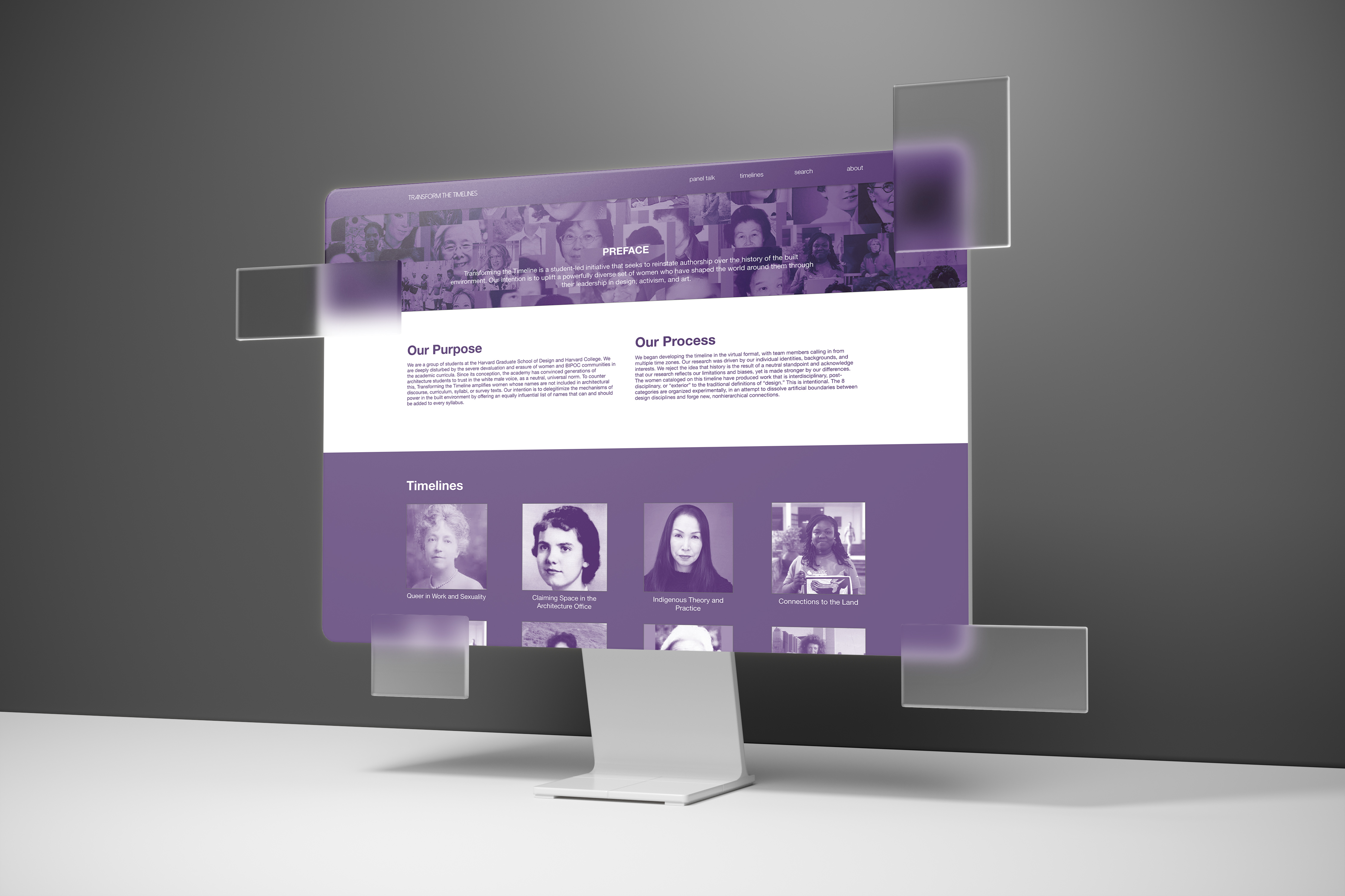
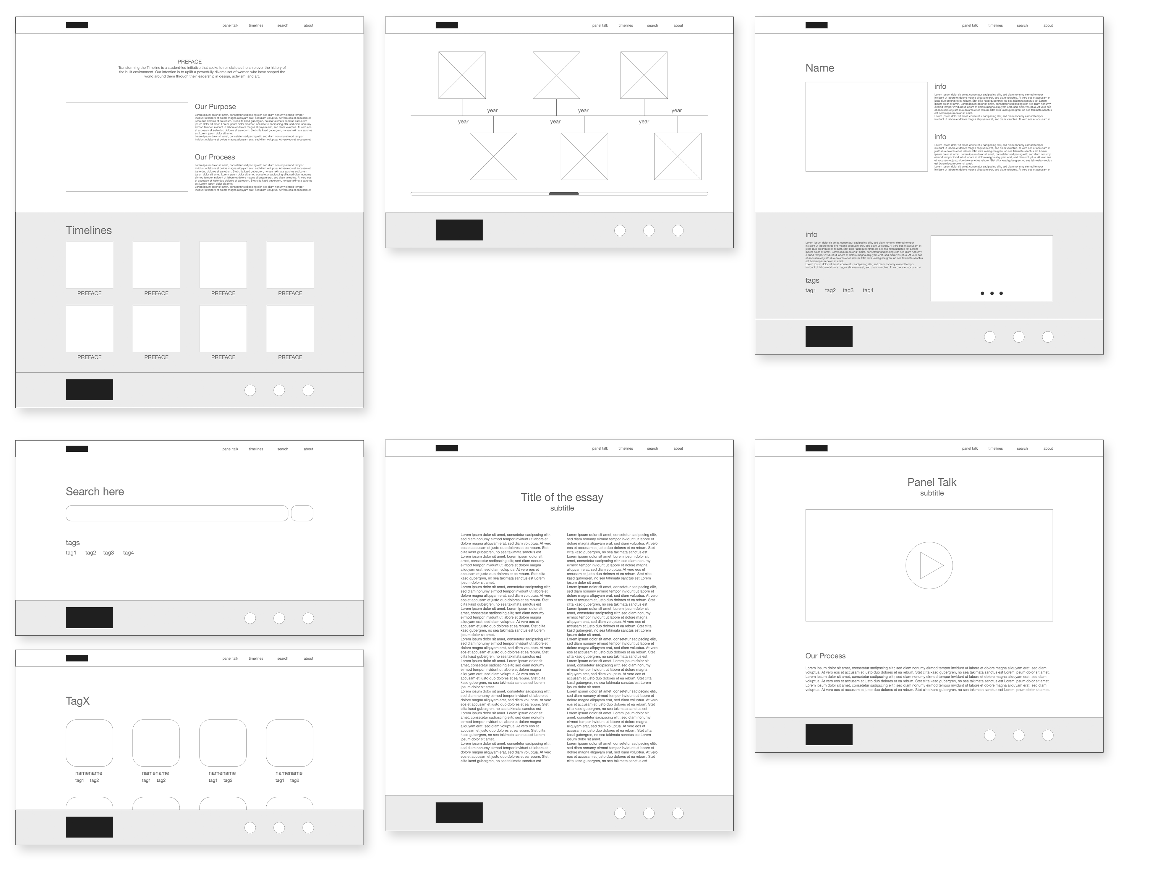
Previous website
Current website offerings
︎
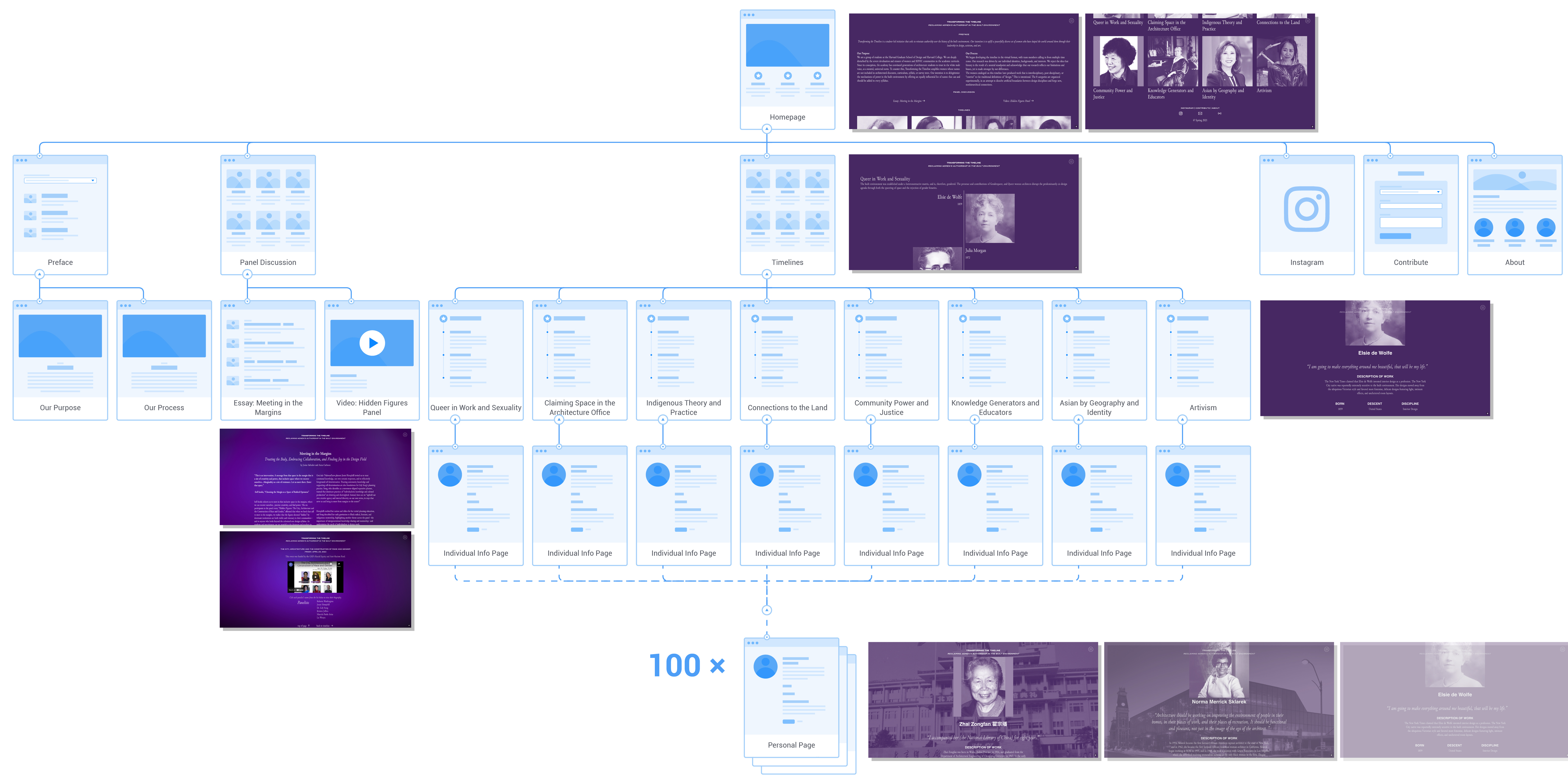
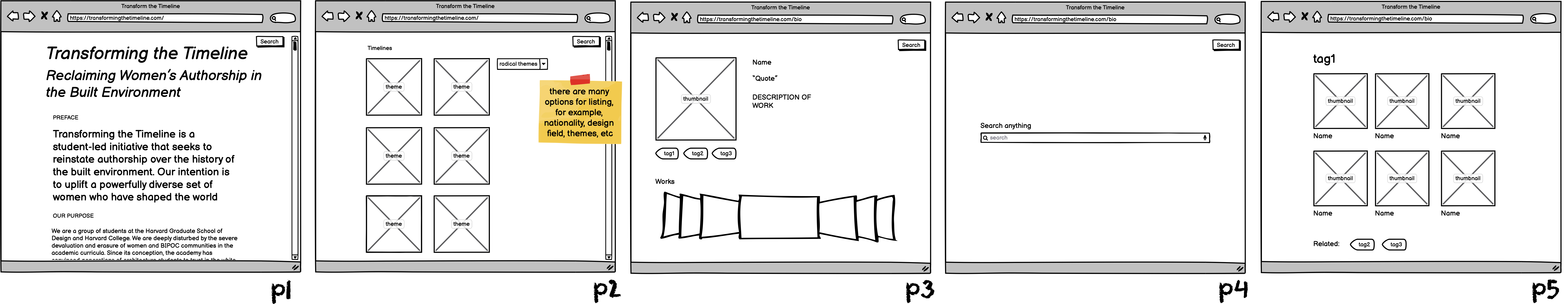
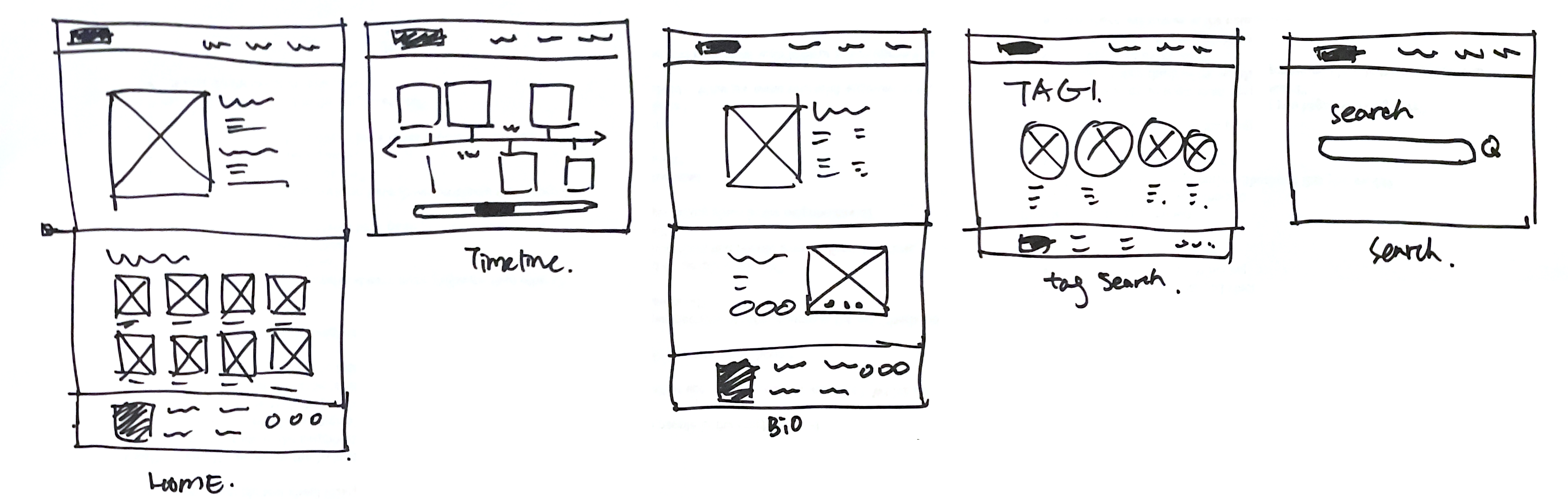
Website information architecture
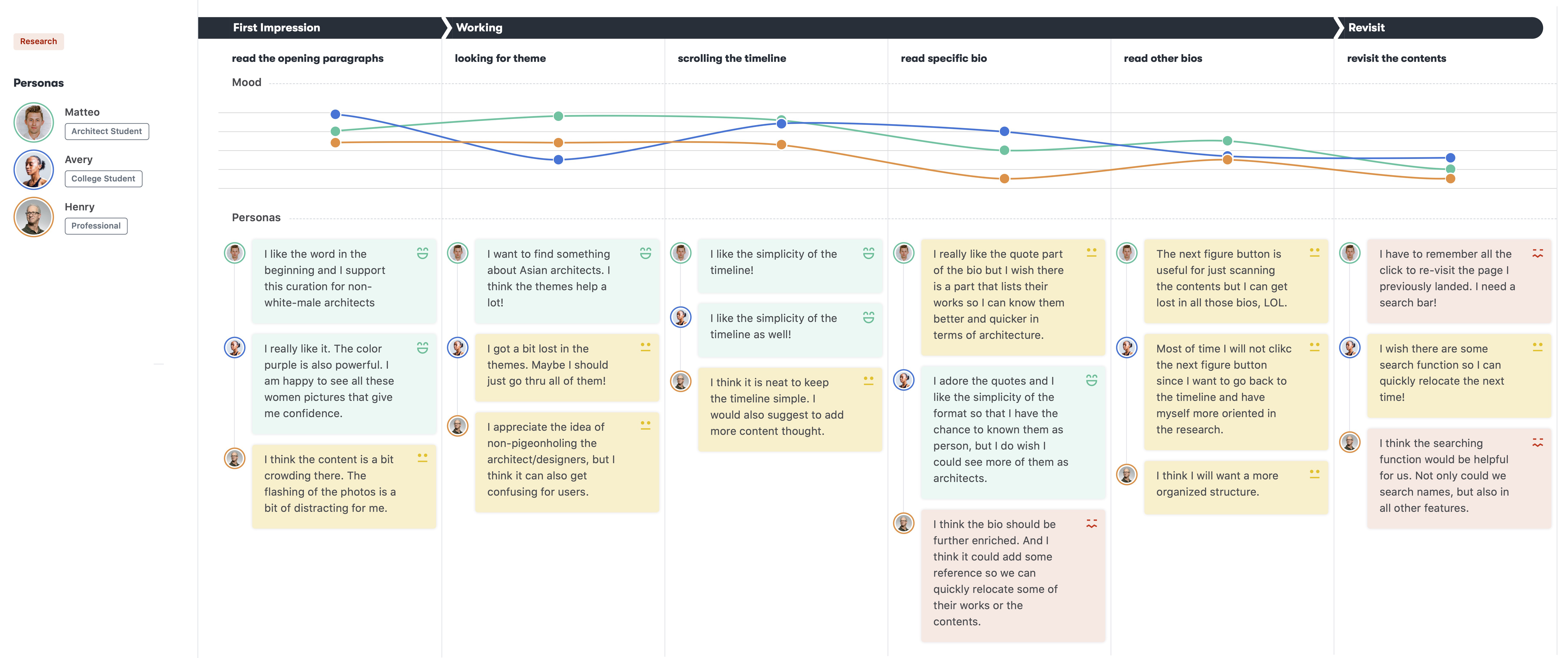
User Research
︎
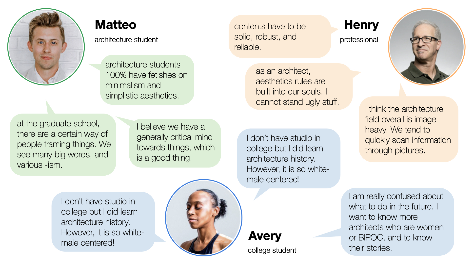

Matteo
Matteo is a graduate student majoring in architecture who needs more knowledge about BIPOC architects because he researches the topic of diversity.
Matteo is a graduate student majoring in architecture who needs more knowledge about BIPOC architects because he researches the topic of diversity.
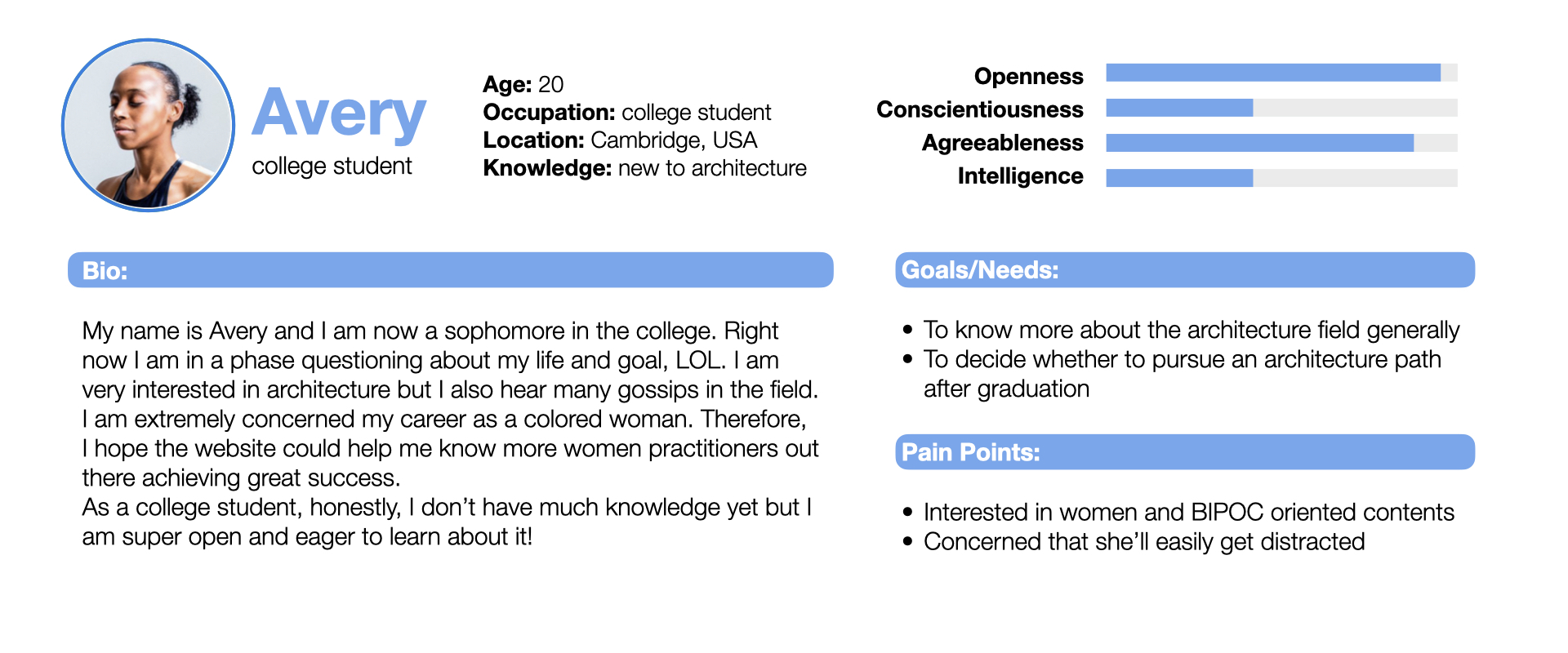
Avery
Avery is a college student interested in pursuing architecture which needs to learn about the landscape of the industry because she is looking for a role model for her career pursuit.
Avery is a college student interested in pursuing architecture which needs to learn about the landscape of the industry because she is looking for a role model for her career pursuit.

Henry
Henry is a professional architect who needs a more diverse portfolio of architecture design because he wants to get inspired for his works.
Henry is a professional architect who needs a more diverse portfolio of architecture design because he wants to get inspired for his works.
The contrast check is passed, so the issue might lie in the design.
https://webaim.org/resources/contrastchecker/

- The homepage is too crowded and overwhelming
- The purple can be overwhelming sometimes
- The gifs are too blinking and become distractive
- The bio pages don’t have much information and don’t link to their firms’ pages, etc.
- There is no search engine on the website for quick access
- A clearer and more inviting homepage
- Tags for better structure of the complex web of figures
- A better-designed timeline representation
- Richer and more interactive bio pages
- A search function for easier visiting and re-visiting
Ideate
︎
Product solution
︎

Features
︎
The new homepage employs a layer-design which makes the information much clear. No blinking gif; it is easier to focus and search.
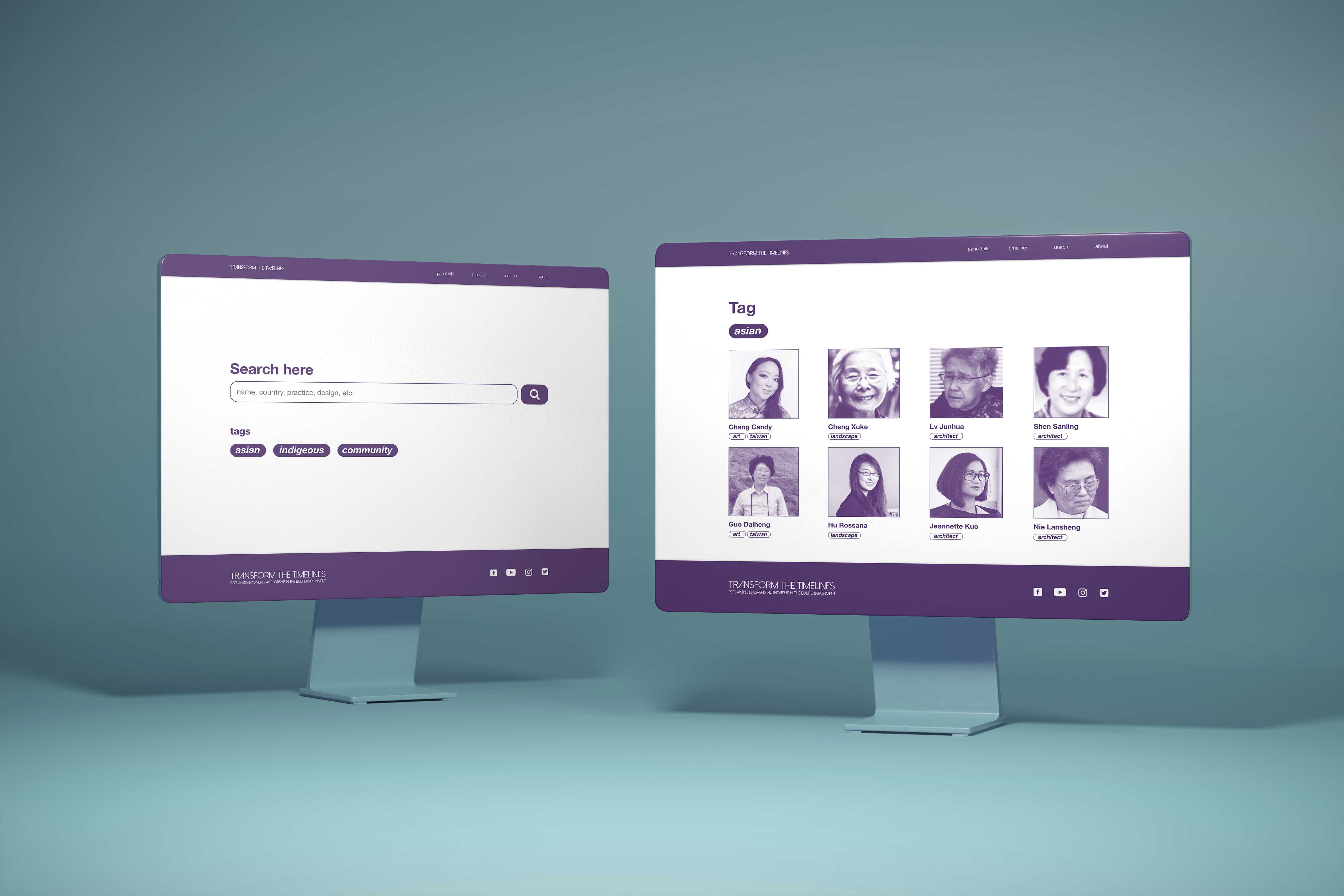

Interaction is a huge part of the new design. The newly designed timeline is all about interaction. You move the bar to have the time machine rolling. Users can also tag their figures now, being an active part of the community.
Takeaways
︎